How to Reduce Shopping Cart Abandonment & Increase Sales
Learn how to reduce shopping cart abandonment with effective strategies. Boost your sales and improve the checkout experience today!
To have any real shot at lowering your cart abandonment rate, you first need to get inside your customers' heads and figure out why they're leaving in the first place. It almost always boils down to a few key culprits: unexpected costs that pop up at the last minute, a checkout process that feels like a chore, or being forced to create an account just to buy something.
Fixing these friction points is ground zero for winning back those lost sales.
Why Shoppers Really Abandon Their Carts
Getting a customer to add an item to their cart is a huge milestone. They’ve gone from just looking around to signaling real intent to buy. But then, somewhere between that click and the final confirmation, they vanish. This isn't a small leak; for most online stores, it's a massive hemorrhage of potential revenue.
The statistics are pretty eye-opening. The average cart abandonment rate across the globe is a staggering 70.19%. Think about that—for every ten shoppers who add something to their cart, seven of them walk away. This isn't a fluke; it points to fundamental problems in the online shopping experience that cost businesses an estimated $260 billion in sales they could have recovered.
The Psychology Behind the "X" Button
Understanding why people leave is less about technology and more about psychology. A customer's decision to bail on a purchase is usually driven by frustration, a sudden wave of uncertainty, or a complete loss of momentum.
Imagine you're having a great conversation, and then the other person suddenly starts making things difficult, confusing, or overly demanding. You'd probably end the conversation and walk away. Your checkout process is that conversation.
The most common deal-breakers I've seen over the years are:
- Surprise Costs: The customer has mentally agreed to pay $50 for a product. But by the time they reach the final screen, shipping and taxes have jacked the price up to $68. That's classic sticker shock, and it feels deceptive. It instantly breaks trust and kills the sale.
- Forced Commitment: Forcing a new customer to create an account is like asking for their hand in marriage on the first date. Most people aren't ready for that. They just want to buy their item and move on.
- Checkout Friction: A long, clunky form with too many fields creates mental drag. Each extra click or required piece of information is another chance for a shopper to decide it's just not worth the hassle.
A cart is not a commitment; it's a consideration. Your checkout is the last chance you get to convince the customer that their consideration was the right one. Make it incredibly easy for them to say yes.
The Impact of Common Checkout Hurdles
These issues aren't just minor annoyances; they are the primary drivers of lost sales. We've compiled some of the most common reasons shoppers leave, ranked by how much they impact a customer's decision to complete a purchase.
Top Reasons for Shopping Cart Abandonment
| Reason for Abandonment | Impact Level | Quick Solution |
|---|---|---|
| Unexpected Extra Costs (Shipping, Taxes, Fees) | High | Be transparent about all costs upfront on the product page. |
| The Site Wanted Me to Create an Account | High | Offer a guest checkout option. |
| Too Long / Complicated Checkout Process | High | Simplify the form; only ask for essential information. |
| I Didn’t Trust the Site with My Credit Card Info | Medium | Display trust badges (SSL, McAfee, Norton) and offer trusted payment gateways. |
| Couldn't See / Calculate Total Order Cost Up-front | Medium | Provide a shipping calculator and display the total cost in the cart. |
| Website Had Errors / Crashed | Medium | Regularly test your checkout flow on different devices and browsers. |
| Delivery Was Too Slow | Medium | Offer multiple shipping options, including expedited choices. |
| Returns Policy Wasn't Satisfactory | Low | Clearly state a fair and easy-to-understand return policy. |
| Not Enough Payment Methods | Low | Include popular options like PayPal, Apple Pay, and Google Pay. |
As you can see, the biggest barriers are often the simplest to fix. Focusing on transparency and convenience can make a massive difference.
Finding the Leaks in Your Own Funnel
While industry-wide data gives you a great starting point, the real gold is in your own analytics. Every store is different. Maybe your problem is a buggy shipping calculator, a lack of payment options like PayPal or Apple Pay, or a mobile checkout that’s impossible to use on a small screen.
You have to dig into your store’s data to see exactly where people are dropping off. This means going beyond the overall abandonment rate and looking at each specific step of your checkout.
By understanding your audience's unique journey, you'll get a much clearer picture of what changes will have the biggest impact. For a more structured approach, you might want to read our guide on what is customer behavior analytics. It's a great resource for learning how to turn that raw data into a concrete plan for improving your user experience and, ultimately, your bottom line.
Streamline Your Checkout for a Seamless Experience
Once a customer hits "add to cart," the real test begins. Every single click, every form field, and every moment of confusion from that point on is a potential exit ramp. A clunky or demanding checkout is the number one reason a motivated buyer becomes just another abandoned cart statistic.
Your goal isn't just to provide a way to pay. It’s to pave a smooth, frictionless path from their cart to a completed order. Think of it as the final leg of a race—don't let them trip right before the finish line.
This simple choice respects the customer's time and intent, knocking down one of the biggest walls in eCommerce checkout.
Let Them Check Out as a Guest
Forcing a first-time shopper to create an account is a massive conversion killer. Why? Because it feels like an unnecessary commitment when all they want is to buy your product. In fact, studies consistently show that around 34% of shoppers will abandon their purchase if creating an account is mandatory.
By offering a guest checkout option, you're sending a clear message: "We value your purchase more than your data." This small gesture builds immediate trust and removes a huge barrier.
You can always circle back and offer them the chance to create an account after the sale is complete. On the confirmation page, a simple checkbox that says, "Save my info for next time?" works wonders. It's a much smoother, lower-pressure approach.
Be Ruthless with Form Fields
Every field you ask a customer to fill out is a tiny bit of work. The more work, the more likely they'll get frustrated and leave. Your job is to cut out every single field that isn't absolutely essential.
Do you really need their phone number right now? Can you default the billing address to be the same as the shipping address? Shave off every unnecessary second.
A single-page or accordion-style checkout is a great way to make the process feel less intimidating by keeping everything on one screen. Better yet, let technology do the heavy lifting for them:
- Address Auto-fill: Integrating tools like the Google Maps API can populate a customer's address as they type, which speeds things up and prevents typos.
- Smart Defaults: Pre-select the most common options. For instance, have the "use shipping address for billing" box already checked. Let them change it only if they need to.
- Deep Customization: For those on platforms like Shopify, you have more power than you think. You can explore how the Shopify Functions API allows for incredible control over the checkout experience, letting you hide, rename, or reorder fields to create a flow that feels tailor-made for your customers.
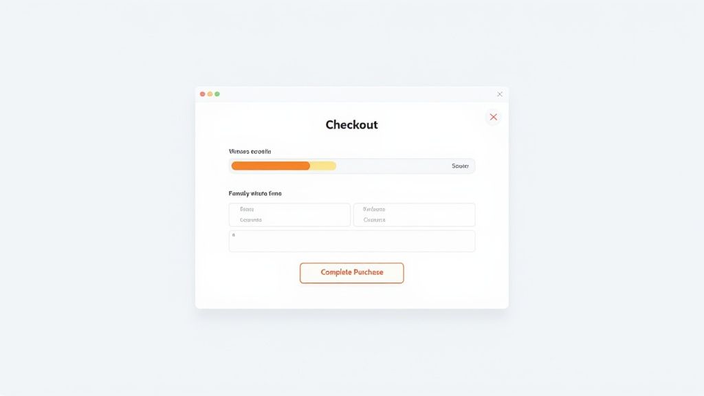
Guide Customers with Visual Cues
A multi-step checkout can feel like a journey into the unknown if the customer has no idea how many steps are left. That uncertainty breeds anxiety, which is a key driver of cart abandonment. This is where a simple visual progress bar becomes your best friend.
A progress indicator acts like a GPS for your checkout. It shows customers exactly where they are, how far they've come, and how close they are to the finish line. It keeps their momentum going.
Label your steps clearly—think "Shipping," "Payment," and "Review." This makes the whole process feel organized and manageable, turning a daunting form into a series of small, easy wins.
Finally, make your call-to-action (CTA) buttons impossible to miss. They should pop with a contrasting color, and the text should be direct and action-oriented. Use "Continue to Payment" or "Complete Purchase" instead of vague words like "Submit" or "Continue." Every element should be designed to push the user forward with confidence.
Mastering Mobile Checkout for On-the-Go Shoppers
Let's be real: your customers aren't sitting at a desk anymore. They're shopping on the bus, in a waiting room, or during a quick lunch break. If your checkout process wasn’t built for someone navigating with one thumb, you're practically handing sales to your competitors. A clunky mobile experience isn't just a minor annoyance; it's a primary reason people abandon their carts.
The numbers don't lie. The gap between desktop and mobile conversions is a canyon. Mobile shopping is where the biggest drop-off happens, with abandonment rates projected to soar to between 80.2% and 85.65% by 2025. That’s a huge leap from the roughly 70% we see on desktops. Why? Smaller screens, frustratingly slow typing, and spotty connections all contribute. You can dig into these cart abandonment statistics to see just how big the mobile challenge is.

Fixing this isn't about just shrinking your desktop site. It’s about a complete mindset shift—rethinking the entire journey from the ground up to prioritize speed and effortless interaction.
Design for Thumbs, Not Cursors
A mouse offers pixel-perfect precision. A thumb does not. It's bigger, clumsier, and covers a lot more of the screen. This is where "fat-finger" errors derail a purchase. When a customer repeatedly mistaps a tiny button or struggles to select a microscopic form field, their patience wears thin fast.
To build a truly thumb-friendly interface, you need to be generous with your tappable real estate. Every interactive element—buttons, links, form fields—needs a big, welcoming target area.
Here are a few design principles I’ve seen work time and again:
- Go Big with Buttons: Make your primary call-to-action buttons span the full width of the screen. They become impossible to miss and incredibly easy to tap.
- Stick to a Vertical Flow: A single-column layout is your best friend on mobile. It eliminates the need for annoying horizontal scrolling and pinching to zoom. The user’s only job should be to scroll down.
- Keep Forms Lean: On mobile, less is always more. Collapse optional fields by default. And for things like phone numbers or credit card details, automatically trigger the numerical keypad. It's a small touch that makes a huge difference in data entry speed.
Make One-Tap Payments the Star of the Show
If you do one thing to slash mobile abandonment, it should be this: eliminate manual payment entry. Nothing kills conversion momentum faster than asking a customer to painstakingly type out a 16-digit card number, expiration date, and CVC on a tiny touchscreen.
This is where digital wallets are an absolute game-changer.
By integrating options like Apple Pay, Google Pay, and Shop Pay, you let customers buy with a single tap. They authenticate with a fingerprint or face scan, and that's it. It’s the closest you can get to a completely frictionless transaction.
Digital wallets transform a multi-step chore into a single, secure action. By removing the biggest point of friction—manual payment entry—you can dramatically increase your mobile conversion rate.
This isn’t just about making things easy; it’s about meeting a new standard. Shoppers now expect this level of speed and security. If you don't offer it, your store can feel outdated and, frankly, less trustworthy.
Your Mobile Flow: Fast, Simple, and Ruthless
Mobile users have zero patience for lag. A slow-loading page or a checkout with too many steps will send them bouncing. Every single second counts. You have to be ruthless in your quest for speed.
This means optimizing everything—compressing images, minifying code, and actually testing your site’s performance on a real 4G network, not just your office Wi-Fi. The checkout flow itself also needs to be stripped down to the bare essentials.
Imagine a simple, three-step mobile process:
- Cart Summary: A clean overview of the items and a prominent "Proceed to Checkout" button.
- Shipping & Payment: Just one screen. Digital wallet options are displayed right at the top. If a customer taps one, they bypass the address forms completely.
- Confirmation: A final chance to review the order before the last tap confirms the purchase.
This flow is intuitive, incredibly fast, and shows you respect the customer's time. By focusing on thumb-friendly design, embracing digital wallets, and committing to a lightning-fast, simple process, you can transform your mobile store from a leaky bucket into a powerful conversion machine.
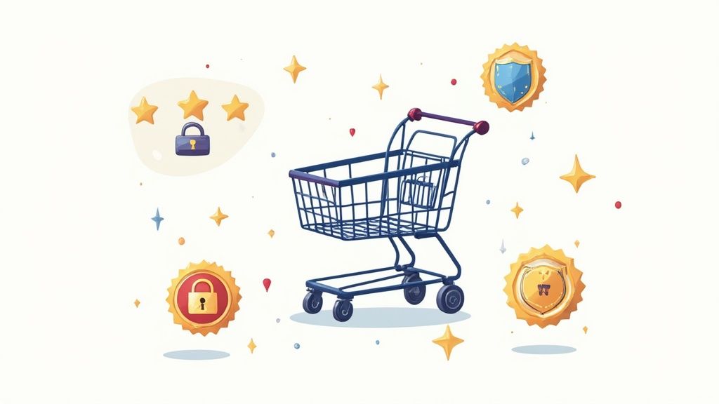
Building Trust and Transparency to Secure the Sale
Let's be honest, a customer on the verge of buying is in a pretty fragile state of mind. One little flicker of doubt—a surprise fee, a question about your site's security—is all it takes to send them running. This is why building trust isn't just a fluffy marketing concept; it’s a core strategy for keeping your cart abandonment rate down.
When a shopper feels secure and completely in the loop, they click that "buy" button with confidence. This feeling isn't created in a single moment. It's woven into every part of the experience, from how you present your prices to how you show off your security credentials.
Eliminate Sticker Shock with Upfront Costs
Time and time again, the number one reason people ditch their carts is unexpected costs. It’s a classic scenario: a customer sees an item for $49.99, agrees to that price in their head, and then gets hit with $12 in shipping and $4 in taxes at the very last second. It feels like a bait-and-switch, and it completely shatters their trust.
The fix? Radical transparency right from the start. Don't make them wait until the final page to find out the real cost.
- Show shipping estimates early. A simple zip code estimator on the cart page works wonders.
- Be clear about taxes. Even a small note like "plus applicable taxes" next to the price manages expectations.
- Lean into shipping thresholds. A banner announcing "Free shipping on orders over $75" isn't just an incentive; it clearly communicates your shipping policy.
By being upfront, you turn a potential deal-breaker into a sign that you're an honest, trustworthy business.
Strategically Place Your Trust Signals
Every visitor is subconsciously judging your site's legitimacy from the moment they land on it. You need to give them clear, visual cues that their information is safe with you. These are your trust signals, and where you put them is just as important as having them.
Don't just bury them in the footer and hope for the best. Sprinkle them throughout the checkout process where they'll have the biggest impact.
A customer who feels uncertain won't click 'buy.' Placing a security badge right next to the credit card form isn't just decoration; it's a direct answer to their unspoken question: "Is it safe to pay here?"
Think about these high-impact placements:
- Security Badges (SSL, McAfee, Norton): Put these logos right near your payment fields and "Complete Purchase" buttons.
- Accepted Payment Logos (Visa, PayPal, Apple Pay): Seeing familiar payment brands instantly builds credibility.
- Customer Reviews & Testimonials: A snippet of a 5-star review on the checkout page can be the final nudge a hesitant shopper needs.
Make Your Policies and Support Easy to Find
Uncertainty about what happens after the sale is just as powerful a deterrent as pre-purchase anxiety. Shoppers worry about returns, exchanges, and who to contact if something goes wrong. If they can’t find those answers in a few seconds, they’ll often bail rather than risk the potential headache.
Make your key policies impossible to miss. A simple link to your "Return Policy" or "Shipping Information" in the header or footer of the checkout page can calm a lot of nerves.
Better yet, show them a real human is ready to help. A live chat widget or a visible customer service number sends a powerful message: we're here for you if you get stuck.
It’s also crucial to remember that what builds trust in one country might not be enough in another. Asia, for instance, often sees cart abandonment rates as high as 84%. This is driven by local expectations, like the demand for free shipping and returns, or a preference for flexible delivery options, which 45% of Chinese consumers prioritize. Sustainability is another huge factor, with 92% of Indian shoppers citing it as a reason for bailing. To really nail this, you have to understand these nuances. You can dive deeper into these findings on regional cart abandonment trends from VWO to see how you might need to adapt your strategy for a global audience.
Recapture Lost Sales with Smart Recovery Strategies
Even with a perfectly slick checkout, shoppers get distracted. Life happens. A phone call, a crying baby, or just a moment of second-guessing can lead to an abandoned cart. But that doesn't have to be the end of the story.
This is where your safety net comes in: a smart, multi-layered recovery strategy. The goal isn't to be pushy. It's about sending helpful reminders and timely incentives that reignite that initial spark of interest. A great recovery plan can turn a surprising number of those almost-sales into real revenue.
Think of it as an automated loop designed to bring would-be customers back into the fold.
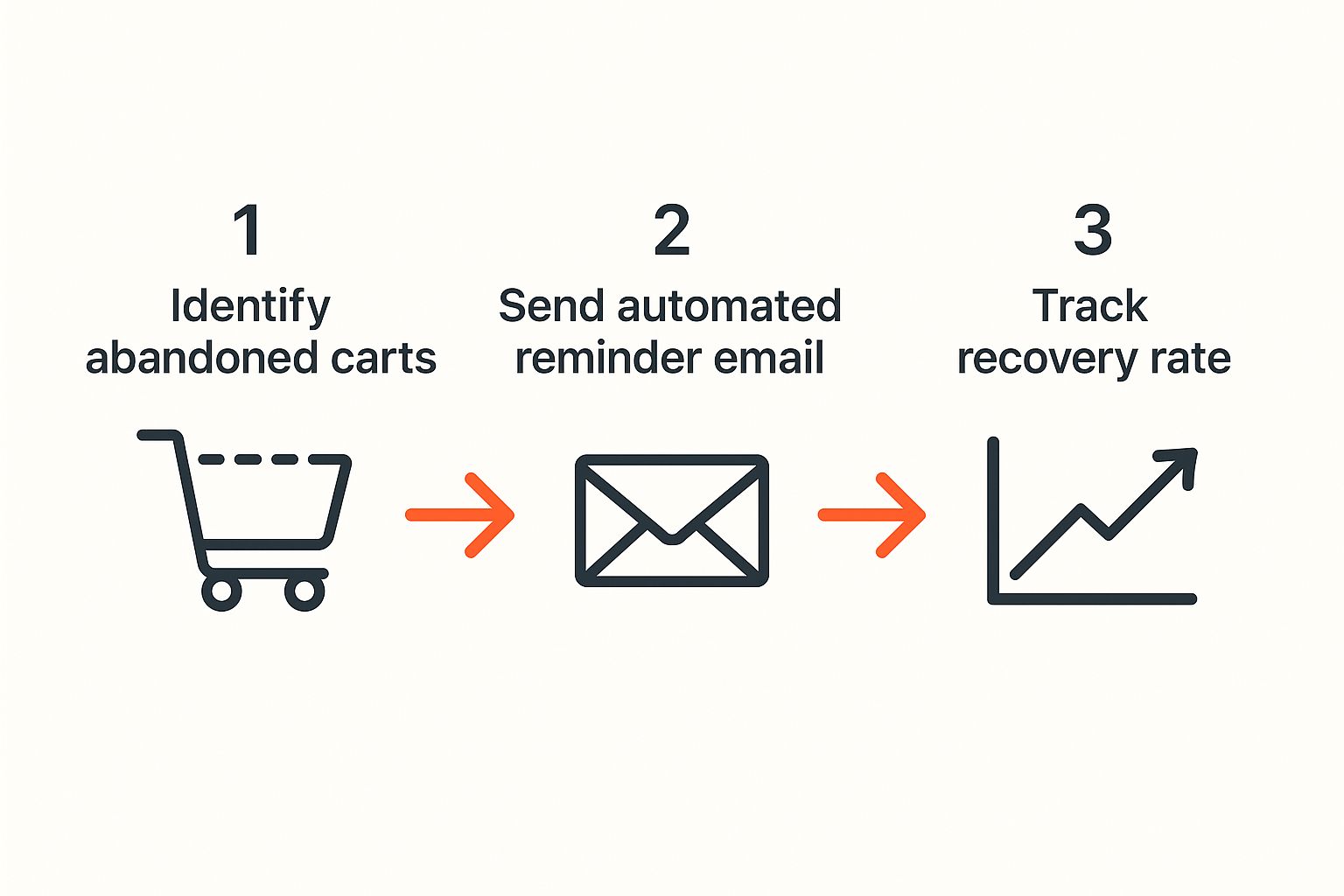
Your Most Powerful Tool: The Abandoned Cart Email
If you do nothing else, set up an abandoned cart email. This is, by far, your most effective recovery tool. The engagement on these is incredible. Data consistently shows that nearly half of all abandoned cart emails get opened, and over 10% of them lead to a completed purchase.
That’s a huge win from a single, automated message.
But you can't just fire off one generic email and hope for the best. To really move the needle, you need a strategic sequence.
Crafting an Email Sequence That Works
A multi-email campaign lets you build on your message without annoying the customer. Each email should have a clear, distinct purpose, evolving from a gentle nudge to a more compelling offer. It’s more of a friendly conversation than a hard sell.
From my experience, a three-part structure works wonders. Here's a proven timeline to get you started.
Cart Recovery Email Campaign Sequence
This table outlines a sample campaign that balances helpfulness with a gentle sense of urgency.
| Email Timing | Subject Line Strategy | Content Focus |
|---|---|---|
| First Hour | Simple & Helpful ("Did you forget something?") | A straightforward reminder showing the items they left behind. The tone here is pure customer service—just letting them know you've saved their cart for convenience. |
| 24 Hours | Scarcity or Social Proof ("Your items are selling fast!") | Now, you can introduce a little urgency. Mention that an item is a bestseller or that stock is getting low. Including a five-star review for one of their cart items works great here, too. |
| 48-72 Hours | Direct Offer ("Here's 10% off to complete your order") | This is your final, most persuasive push. Offer a small, time-sensitive discount or free shipping to give them a real, tangible reason to come back and seal the deal. |
This progression respects where the customer is in their thought process and dramatically improves your odds of winning them back.
Key Takeaway: The first email should feel like helpful customer service; the last one should feel like a special opportunity.
Stop Shoppers in Their Tracks with Exit-Intent Popups
Emails are fantastic for bringing people back, but an exit-intent popup can stop them from leaving in the first place. This clever tech tracks a user's mouse movements and, just as they're about to leave your site, triggers a popup.
This is your last-ditch effort to keep them around, so make it count. A generic "Don't Go!" message is useless. Your offer needs to be compelling and tackle a likely reason for their departure.
- Offer a Discount: "Wait! Get 15% off your first order." This is a classic for a reason—it hits the price objection head-on.
- Provide Free Shipping: "Leaving so soon? We'll cover the shipping." This is perfect for neutralizing the sting of unexpected costs at checkout.
- Capture Their Email: "Join our list for exclusive deals, and we'll save your cart." This strategy turns a potentially lost sale into a valuable new lead.
Stay Top-of-Mind with Retargeting Ads
Let's be real: not everyone will open your emails. For those who slip through the cracks, a subtle retargeting campaign is the answer. Using ad platforms like Facebook or Google Ads, you can show ads to users who visited your site and left items in their cart.
The key here is subtlety. You’re not trying to stalk them across the internet. A well-run campaign will show these ads for a limited time and at a low frequency. It’s a gentle reminder, not an aggressive chase.
Combining these tactics is fundamental to figuring out how to reduce shopping cart abandonment. For a deeper look at reclaiming customers who have gone cold, check out these powerful customer win-back strategies that perfectly complement these recovery efforts.
Your Top Cart Abandonment Questions Answered
When you're trying to tackle cart abandonment, a few key questions always seem to pop up. Let's cut through the noise and get you some straight answers from the trenches, so you can focus your energy on what actually works.
I've seen these same questions come from countless e-commerce merchants. Here’s a no-fluff breakdown of what you really need to know.
What Is a Good Cart Abandonment Rate?
This is the big one, isn't it? The truth is, there's no magic number. A "good" rate really depends on your industry. If you're selling travel packages or high-ticket electronics, people will naturally shop around more, leading to higher abandonment rates than, say, a fast-fashion brand.
As a general rule of thumb, the global average hovers around 70%. If you can get your rate below that, you're on the right track.
But if you’re seeing numbers in the 80% range or higher? That’s a serious red flag. It’s a sign that something in your checkout process is actively pushing customers away. On the flip side, if you've managed to get your rate down into the 50-60% range, you're doing phenomenally well and outperforming most of the competition.
The goal isn't zero abandonment—that's a fantasy. The real win is chipping away at your rate, pushing it consistently below your industry's benchmark through smart, incremental changes.
How Do I Know If My Changes Are Actually Working?
You can't just throw solutions at the wall and hope something sticks. You have to measure. The most straightforward way to see if your efforts are paying off is by watching your cart abandonment rate in your analytics platform like a hawk.
Here's a simple, methodical way to do it:
- Set Your Baseline: First, figure out your average abandonment rate over a solid 30-day period. Don't touch anything yet—just get your starting number.
- One Change at a Time: This is crucial. If you update your guest checkout and add new payment options simultaneously, you'll never know which change made the difference. Isolate your variables.
- Measure and Compare: After you've rolled out your single change, let it run for another 30 days. Then, compare the new rate to your original baseline.
This disciplined approach is how you get real, undeniable proof of what actually convinces your customers to click "buy."
If I Can Only Make One Change, What Should It Be?
Looking for the one tweak that gives you the most bang for your buck? It’s simple: get all the costs out in the open, right from the start.
Year after year, the number one reason shoppers bail is sticker shock. They get all the way to the final payment screen, only to be ambushed by unexpected shipping fees, taxes, or other random charges. It’s a huge turn-off and it instantly breaks trust.
You can fix this. Add a shipping calculator to your cart page that works with just a zip code. Put a clear, bold banner at the top of your site that says "Free shipping on all orders over $50." Setting clear expectations upfront is the single most powerful way to reduce abandonment and show customers you respect them.
Ready to turn those abandoned carts into loyal customers? Toki offers the tools you need to build a powerful loyalty and rewards program that keeps shoppers coming back. From point-based rewards to engaging referral programs, discover how you can increase repeat sales and build a thriving brand community at https://buildwithtoki.com.